Thursday, 11 December 2014
travelogue
I have woken up not knowing who I am or were I am, I cannot
describe to you what I look like as I don’t remember, I am only going on what
my features feel like. I cannot tell you about my history as far as I am
concerned I don’t have one I have woken up feeling like the world has given
birth to me again to just let me die stranded in this desert. All I know is
that I am to hot and can’t survive in these hot conditions and need to seek help.
After an exhausting journey through an extremely hot desert I have come to a
point where I am close to giving up. I don’t think I can carry on, my body is
running out of energy and I can start to feel my mind drifting and the numbness
of my aching body to go. I am considering taking a break and resting when I
reach the nearby peak of this sand dune but I am not entirely sure if that’s a
wise move. As I reached the peak what I could see was nothing short of a
miracle but was somewhat amazing. A beautiful colourful city which didn’t quite
make sense, at my first glance I thought this was the end and that my mind was
playing tricks on me but as I began to walk further I realised that I was in
fact sane and that I had discovered a metropolis that’s physics made no sense
to any human study and was defying the laws of physics.
As I begin to
approach the city I begin to realise that the architecture of the buildings are
completely unique taking barely any influence from any other cultures with a
much more crisp and clean organic forms to their structures. I have never seen
any buildings quite so big and breathe taking. As I am walking to the city I
begin to think how is it that I have never heard of this place and how is it I
haven’t seen one road that leads to it. I finally reach the city gates after
walking for another good mile were I am greeted by a voice com asking how it is
I have come open there hidden city and what my purpose it is that I am here. I
explained that I woke up with no memory of who I am or how I ended up here but
am in some serious need of water for dehydration, I pleaded for their help and
waited for a reply anxiously, I didn’t even get a reply I went to pleaded once
more but as my mouth open the gates had opened and I stepped foot in this
metropolis like no other, I feel my knees go weak and my mind go blank I can
feel myself fall to the floor.
Yet again I have woken from blacking out this time I am in
the company of a doctor who explains that my body is in perfect condition and
that I will be fine. I am startled with so many questions he tells me that I
should get out of bed and walk with him whilst he explains what will happen
from here on. We’ve been speaking for some time now and he has explained that I
have reached the richest and wealthiest part of world hidden away from the
media and the outside world it answers to no country and has their own form of
laws and government in some respects it’s not just a city but a country in its
own rights as it answers to no country. The doctor begins to explain that once
allowed into the city there is no exit and that each person has a there role
and that I am to attend my appointment at the job centre which is in 3 hours.
He leaves me with a digital map allowing me to explore the city and find the
job centre.
As I walk round the city the first thing that stands out to
me is how some buildings are strapped to the floor as if they are ready to
float of into space. They look amazing but I wonder how it is that they work
and what purpose is it that they are floating and how did people even enter the
building. I am so amazed so I take my time to stand there and analyse the
building as I’m looking I notice on my digital map that its turned twelve
o’clock and suddenly the bottom of the sphere has opened and a multiple lifts
have begun to come down to the floor and people are leaving. I notice on the
map that these buildings are in fact company buildings which would make sense
that people leave it time sync to clock work, although this place is huge it troubles
meme it has a sinister tone to it as the place is incredibly beautiful and
colourful but there is kind of feel of being trapped here like once you’re in
the building you aren’t allowed to leave once your shift is over and the fact I
haven’t been given an option to leave.
I carry on walking round the streets of this kind of utopia
looking metropolis coming across buildings that bend and curve forming
beautiful shapes but don’t have any form of structure to support them which I
can’t work out how this is possible it is clear that this is a city the is far
more advanced then what I recall civilisation is like. I notice that buildings
also intertwined with each over above you so when you walking along the street
the building to the left of you will bend to the one to the right and joining
there structures. As I know I’m not left
with much time I just analyse the rest of the city using the map and the city
has everything it needs but has a clear difference between class although the
place has been built for the rich and is utopia for them on the outer skirts of
the city difference it has the inner
circle of the city were the rich are where they live there every day lives not
having to work or have a care in the world from the Arial view it look like an
incredibly wealthy suburbs with dome pods for houses. On the outside of this
extremely wealthy area you have places of leisure and things every city needs
for entertainment like clubs and cinema all still winding and connecting
hectically round the city. On the outer side of this you have the factories and
were people like me I assume work who work enough to get by to live in this
utopia.
When I reach the job centre it is the only building that is
completely white like a blank canvas I’m assuming it’s because it’s a fresh
start to a new life. When I entre I realise how clean the interior of the
building is and how almost alien it is to what I remember. There is a row of
chairs made of a jelly material that are extremely comfy I sit here looking
around waiting for my new life to begin wondering what lays ahead of me.
Film Review: Suspiria (1977)

Figure 1: Movie Poster
Suspiria (1977) is a film directed by Dario Argento it is a stereo typical horror/slasher which will forever stay in your mind. Although the film will stick with you forever its most certainly not for its narrative story line as its pretty poor like many other slashes before and after this time but the set and production design is what stands out. The story is about a young American ballet student called Suzy Bannion (Jessica Harper) who has come from New York to a European ballet academy where she is forced to stay and live in the academy by a series of unfortunate events. After Suzies arrival a couple of unexplainable murders had occurred paired with Suzies suspicions of the teachers never leaving the school Suzy begins to investigate and discovers that the teachers and its staff are in fact witches.

Figure 2: A still shot showing Suspiria strong use-age of lighting to create atmosphere
The film puts the viewer on edge the whole way throughout the film from the clever production design and the chilling soundtrack which was produced by an Italian band called "Goblin". The scene in particular that stands out for production design is when the women is running away from the academy in the opening scene, Whilst you are watching this women fight her way through a forest in the torrential rain we also get to see flashes of colour making us think of blood being splattered. Jennie Kermode comments on t he film saying "This is horror shot with dazzling energy yet with the visual depth and acuity of a Renaissance painting. Those who doubt the artistic potential of the horror genre should be nailed down and made to watch it." (Kermode, 2008).

Figure 3: a shot showing the over usage of red
The key role in what saves this film from its awful acting and narrative story line is the cinematography and Argento's use of lighting to create a sense of atmosphere. The most dominate colour through the film is the brilliantly striking use of red throughout the film, from the lighting, the walls, to the opening death scene were the blood pouring out of the women's skull. Janet Maslin also agrees with statement by saying "Argento's methods make potentially stomach-turning material more interesting than it ought to be. Shooting on bold, very fake-looking sets, he uses bright primary colors and stark lines to create a campy, surreal atmosphere, and his distorted camera angles and crazy lighting turn out to be much more memorable than the carnage." (Maslin, 1977).

Figure 4: Still shot of the horrific opening scene.
Overall Suspiria is a brilliantly beautiful film with its over used but incredibly necessary use of the colour red, the film is very un-easy the whole way through which is quiet a strange feeling its like tasting something sweet but sour as there two opposites your don't want to look out of fear but you do want to look because of the stunning visuals. Jackson Buchanan sums up this film really well by saying "this unrelenting tale of the supernatural was - and likely still is - the closest a filmmaker has come to capturing a nightmare on film." (Buchanan, s.d.)
Illustration List
Figure 1: http://upload.wikimedia.org/wikipedia/en/c/cd/SuspiriaItaly.jpg
Figure 2: http://www.samefacts.com/wp-content/uploads/2014/10/suspiria-Technicolor.jpg
Figure 3: https://blogger.googleusercontent.com/img/b/R29vZ2xl/AVvXsEhOTrn6p3CsaRx3c2znl2hJsDSRQAfFtHYUCfIOmwapZpLLDwLIwoivrPhqR7Qz3N0B1a0zSbB4sNyv8XOnoyDFwHupSpo4TxB0-z-pZpg2IRRJnzGpAMWLb7Vw2I9DvxpjDSBsBhaoUea3/s1600/suspiria03.png
Figure 4: https://brendancultfilms.files.wordpress.com/2011/12/suspiria1.jpg
Bibliography
J Kermode Eye for Film 2008: http://www.eyeforfilm.co.uk/review/suspiria-film-review-by-jennie-kermode
J Maslin NY Times1977: http://www.nytimes.com/movie/review?res=990CEFDB1F3BE334BC4B52DFBE66838C669EDE
Buchanan all movie: http://www.allmovie.com/movie/suspiria-v48031/review
Film Review: "The Shining" (1980)
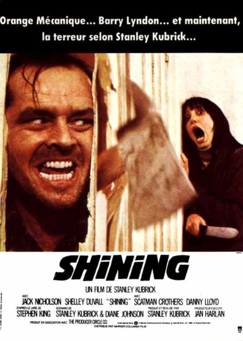
Figure 1: Movie poster
This beautifully directed adaptation of the Stephen King novel by Stanley Kuberick is a thrilling and honorific work of art. Right from the start you begin to feel a sense of tension building and developing as the main character, a struggling writer Jack Torrence (Jack Nicholson) takes on a one of job as an off season caretaker of a secluded hotel during the winter months. As the isolation and frustration of the hotel start to really effect Jack he begins to turn against his family.

Figure 2: a scene showing the inside of the hotel
Kubrick doesn't give us any completely clear answers in the type of relationship jack has wife his wife Wendy (Shelley Duvall) have but you are given the impression that relationships been hostile for a while in the way that Wendy is forever nervous and seems to be a suffering wife to her husband who is extremely sarcastic, short tempered and perhaps has had some trouble with alcohol. Danny Jack's son is gifted with physic power, he has an imaginary friend called Tony who warns him of the evil that is within the hotel walls. Tony tells Danny the story of the old care taker who went stir crazy and lost his mind, Tony also tells Danny that the caretaker killed his wife and his two daughters who also appear to Danny throughout the film. The set is a key feature in what makes this film so great as its visually stunning and starts out to be a beautiful opportunity to explore the depths of the hotel and it gradually starts to change into being more maze with no escape. Peter Bradshaw coments on the set saying "instead of the cramped darkness and panicky quick editing of the standard-issue scary movie, Kubrick gives us the eerie, colossal, brilliantly lit spaces of the Overlook Hotel" (P Bradshaw, The Guardian 2012).
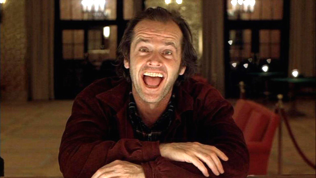
Figure 3: still shot of jack loosing his mind
There is no doubt that Kubrick is known for his attention to detail and his methods of directing films but "The Shining" (1980) is his crown jewel and best master piece in creating a film the way he wanted it. Ian Nathan states in Empire that "; Nicholson was force fed endless cheese sandwiches (which he loathes) to generate a sense of inner revulsion, and the recent invention of the Steadicam (by Garret Brown) fuelled Kubrick's obsessive quest for perfection. The result is gloriously precision-made."(I Nathan Empire).

Figure 4: Th most iconic scene throughout the scene.
The whole film is incredibly intense and is constantly making the viewer feel uneasy and on the edge of their seats whilst watching the film. A journalist for the New York Times confirms this statement by saying "The Shining may be the first movie that ever made its audience jump with a title that simply says "Tuesday". (J Maslin, NY times 1980).
Illustration List
Figure 1: http://verdoux.files.wordpress.com/2009/06/french-poster.jpg
Figure 2: http://media2.firstshowing.net/firstshowing/img7/ShiningOverlookhotelScreencap591.jpg
Figure 3: http://d12vb6dvkz909q.cloudfront.net/uploads/galleries/29663/the-shining-1.jpg
Figure 4: http://www.tasteofcinema.com/wp-content/uploads/2013/07/the_shining_2.jpg
Bibliography
P Bradshaw, The Guardian 2012: http://www.theguardian.com/film/2012/nov/01/the-shining-review
I Nathan, Empire: http://www.empireonline.com/reviews/reviewcomplete.asp?FID=132700
J Maslin, New York Times 1980: http://www.nytimes.com/movie/review?res=EE05E7DF1738E270BC4B51DFB366838B699EDE
Film Review: Repulsion (1965)

Figure 1: Movie Poster
This is a very strange a chilling horror film, it was the first instalment of Roman Polanski's "Apartment Trilogy". The story follows a young women called "Carol" (Christine Deneuve) who is a very troubled women living with her sister in a small apartment in London. Carol is an extremely shy and very beautiful women who attracts much attention on a daily basis when the attention is very much unwanted. Her anxieties begin to get much worse when her sister and her new boyfriend decide to go on a vacation and Carol (Christine Deneuve) is left to look after the house.

Figure 2: Still shot showing Carol with all her unwanted attention
Throughout the film the viewer is constantly feeling uncomfortable from the way the director has allot of close intimate shots of carol or first person views on the camera making you feel as if you are in the mind of Carol. Once her Sister has left on vacation with her boyfriend the apartment acts as representation of Carol as the more she looses her mind the more cracks start to appear on the walls. The most disturbing part of the film is that as Carol starts to go mad in anxiety of male attention she has life like dreams of her self being raped this is extremely disturbing to watch but the even more disturbing part is the fact that these dreams are so frequent that she prepares her self for the raping in the last dream of the film. This Horror flick is very strange in the sense that your not left with fear and terror but more sympathy for the character. Another view similar to this is of Kim Newman in her review in Empire "Rather than making a mad person scary, this film terrifies by giving an audience a sense of what it's like to lose sanity" (K, Newman Empire).

Figure3: Carol looking at a crack emerge from bellow her.
For a film that is set during the "swinging sixties" Carol is very unlike other women who are starting to experiment with their bodies in a sexual way most likely due to the recent release of contraception, Carol is most definitely the complete opposite who is developing a phobia the more male attention she gets. During the film there is one man who is nice with good intentions throughout the film but is only making the matter worse for Carol's fears as the more attention she gives the she begins to resent him. Near the end of the film we are given a sense of feeling that Carol has been abused or maybe neglected during her early life by some one who was close and male to her. This is backed up by the evidence shown at the end of the film were an old family photo is shown and Carol is in the background not part of the happy family scene being portrayed by the other family members. This view has also been told by reviewer Jennie Kermode by saying "Her unbalanced state seems to reflect an unbalanced world whose expectations of her are themselves far from realistic" (J Kermode, Eye for film, 2010).

Figure 4: Carol imagining male hands coming through the hallway trying to touch her
There are many reasons in what makes this film so great and incredibly renown but the main reason is the production design from how the apartment works as an interaction to the viewer and as a tool to judge the state of mind Carol is in. Repulsion is also one of the only few films that has the achievement of reaching 100% on rotten tomatoes, Peter Bradshaw for the Guardian described the film as "a deeply disturbing, horribly convincing psychological thriller that is also that rarest of things: a scary movie in which a woman is permitted to do the killing." (P Bradshaw, Guardian 2013).
Figure 1: http://upload.wikimedia.org/wikipedia/en/0/05/Repulsion.jpg
Figure 2: http://www.themoviewizard.com/images/movie%20images/repulsion4.jpg
Figure 3: http://www.horrordvds.com/reviews/n-z/repulsion/repulsion_shot5l.jpg
Figure 4: https://aaastern.files.wordpress.com/2011/08/repulsion.jpg
Bibliography
K Newman (Empire): http://www.empireonline.com/reviews/reviewcomplete.asp?FID=134914
J Kermode (Eye for Film): http://www.eyeforfilm.co.uk/review/repulsion-film-review-by-jennie-kermode
P Bradshaw (the guardian 2013): http://www.theguardian.com/film/2013/jan/03/repulsion-review
Film Review: Black Narcissus (1947)

Figure 1: Movie poster
"Back Narcissus" (1967) is an adaptation of Rumer Godden's 1939 novel which had the same name, the film its self was extremely ahead of its time for the content in which it was based on and for its production design as it was filmed all in a studio yet you are fooled to believe it is filmed at location. It was directed by British film-makers Michael Powell and Emeric Pressburger, The film is a tale of nuns who have been relocated to help a village in the mountains and live in an old not in use brothel.The intentions of the nuns was to build a medic centre and a school for the children but a young Mr Dean (David Farrar) who is there to help the sister settle in to their new home is causing the nuns to doubt their faith and vows to God.

Figure 2: Still shot of one of the sisters ringing the bell on top of the mountain
Throughout the film there is many sexual references building tension between both the sisters and the viewers. The references aren't to obvious but are more subtle all except one were Sister Ruth (KathByron leen) announces to the sisterhood that she is giving up the order and is then later discovered wearing a very striking red dress and also slowly applied lipstick in an erotic way. The lighting throughout the film is also an indication of the sexual tension and frustration is getting to the sisters. Mark Duguid agrees with use of sexuall references and states "Powell and Pressburger's delirious melodrama is one of the most erotic films ever to emerge from British cinema" (M Duguid, BFI).

Figure 3: Shot showing an example of the dramatic matte paintings
One of the key features in what makes this film so amazing in the sense that it really submerges the viewer into really thinking that the matte paintings and set designs are real. The film was preponderantly shot in Pinewood studios in London with the odd Jungle shot filmed in Kent which is really hard to believe whilst watching the film. Empire magazine also commented on this feature by saying " No amount of CGI could ever capture the dramatic splendour of the beautiful matte paintings that push a church bell" (Empire)

Figure 4: Sister Ruth beginning to crack from the sexual tension
There is no doubt that "Black Narcissus" is one of the best films to ever come from British Cinema purely for the fact that it tackled issues of the time that would not have deemed appropriate for its time so they it was done in a creative and subtle way to make it possible. The Films is one of the most acclaimed movies of all time with it being on of the rare few films to be awarded 100% on Rotten Tomatoes. Neil Smith a journalist for total wrote a good summary of what this film is about. "...there's so much more to admire here - from the heightened reality conveyed by the Pinewood sets to Jack Cardiff's sumptuous, Oscar-winning Technicolor cinematography" (N Smith Total)
Illustration List
Figure 1: http://www.doctormacro.com/Images/Posters/B/Poster%20-%20Black%20Narcissus_10.jpg
Figure 2: http://www.silveremulsion.com/wp-content/uploads/2013/04/blacknarcissus_1.jpg
Figure 3: http://backlots.files.wordpress.com/2012/08/blacknarcissus41.jpg
Figure 4: http://www.listal.com/viewimage/1841443
Bibliography
Empire: http://www.empireonline.com/reviews/reviewcomplete.asp?DVDID=119942
M Duguid BFI: http://www.screenonline.org.uk/film/id/438337/index.html
Film Review: "Tim Burton" Edward scissorhands (1990)

Figure 1: Movie poster
This is definitely one of the most iconic and all time classic of the "Tim Burton" directed films. The film its self is an extremely well directed and executed fairy tale set in the 60's with an outcast falling in love with a beautiful lady just like many other fairy tales. Tim Burton adds his own twist on the incredibly over done fairy tale love stories by making it quirky with the lead role of Edward (Johnny Depp) humorous in an awkward way. The story unfolds as a stereo typical 60's american women discovers Edward up in the desolate castle on top of the mountain and decides to do the typical white american Christian thing to do and take him home and look after him.
Figure 2: Shot showing the matt painting of the castle behind the movie set
One of the key features that stands out whilst watching "Edward scissor hands" is the amazing detail in the visual effect. The production design for this film is simply spectacular from how they have included an extremely detailed matt painting in the background of a stereo typical 1960's suburban town, These two things are both extremely miss matched and contrasting yet during the film it looks like its real. Roger Ebert also agrees with the statement by commenting saying that "Burton uses special effects and visual tricks to create sights that have never been seen before" (R, Ebert, 1990)

Figure 3: still shot of Edward
A lot of people are to believe that this is one of Tim Burton's best films and is the most unique to his style. There are many similarities between Edward and Tim Burton himself, there is allot of influence in the way the character of Edward interacts and looks different to normal society based on the creator of the film. Alan Jones comments on this saying "Humanoid Edward's inability to touch the things he loves because of his razor-sharp fingers makes for potent symbolism of the highest mythic order" (A, Jones 1990)

Figure 4: Still shot of Edward and his inventor
It is extremely clear that throughout this film Tim Burton has been heavily influenced in many film in the horror genre like "The Cabinet of Dr Caligari" and fairy tales like "La Belle et la Bete"The guardian comment on this statement by saying "Burton pulls inspiration from Chuck Jones cartoons as well as classic horror films" (Guardian 1990). Overall the film is well directed and produced with a brilliant production team to bring this fairy tale to life.
Illustration List
Figure 1: http://images.moviepostershop.com/edward-scissorhands-movie-poster-1990-1020280845.jpg
Figure 2: http://fogsmoviereviews.files.wordpress.com/2012/05/edward_scissorhands_hill.png
Figure 3: http://www.radiotimes.com/film/rv9n/edward-scissorhands
Figure 4: https://marciokenobi.files.wordpress.com/2012/12/edward-scissorhands-2.jpg
Bibliography
Roger Ebert (1990): http://www.rogerebert.com/reviews/edward-scissorhands-1990
A Jones (1990): http://www.radiotimes.com/film/rv9n/edward-scissorhands
Guardian (1990): http://www.theguardian.com/film/2010/oct/21/edward-scissorhands-burton-fantasy
Film Review: "Nicolas Winding Refn" Only God Forgives (2013)

Figure 1: Movie poster for only god forgives
"Nicolas Winding Refn" has truly out done himself in this brutal tale of a man who questions his morality and judgement of what is right and wrong. The films narrative is completely visually driven an could be a disaster if it wasn't such a visually stunning film. There is very little dialogue throughout the movie and when there is its very minimal especially from the lead character "Julian" (Ryan Gosling).
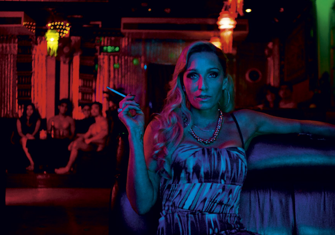
Figure 2: still shot from "Only God Forgives" showcasing its use of lighting
After watching this film the main thing you will walk away with thinking about apart from the hideous violence, is how well this film was produced from the acting, the production design and also the lighting. Peter Bradshaw also comments and hailed the film for these purposes aswell saying "Refn's direction, Larry Smith's cinematography and Beth Mickle's production design are all superb. TheDisturbing tracking shots down infernal corridors brought to mind Travis Bickle's final descent in Scorsese's Taxi driver."(Bradshaw, Gaurdian 2013). Bradshaw really is right to compare these two together as the cinematography is a true master piece.

Figure 3: Still shot of "Julian" (Ryan Gosling)
Through out the film it is extremely hard to work whats real and what could just be an interpretation of Julians mind as there are many scenes in the mind of of Julian with the usage of the first person view point when Julian looks at his hands. Damon Wise a critique for Empire magazine also shares the same views by stating "the Angel is summoned from Julian’s warped subconscious as he deals with the fallout from his dysfunctional and psychopathic family. How much is real is never made clear." (D Wise, Empire, 2013). This statement really does justice to the films hidden messages as your cant quiet tell if the police office "Chang" (Vithaya Pansringarm) is real or if he's actually human as you begin to get a feeling he's super natural as he can pull out a sword from his back when through the shots in the film there is no sword there, he is also way to quick, agile and strong for a man of his age. He is able to beat Julian (Ryan Gosling) who is in allot better fighting condition.

Figure 4: shot of gosling looking remorse in th eblue light after discovering his brother raped and killed a 16 year old girl.
Once film has finished and the credits start to roll as you are still left wondering if "Chang" was real has he ends film film in the karaoke bar you are left with a strange feeling wondering if you liked the film. Many people will have the same views of liking the cinematography that makes the film but not the narrative story or the characters in the film. Robbie Collin also agrees and states "Do I love the film? No. But I love it that Winding Refn has made it." (R Collin, The Times,2013).
Illustration List
Figure 1: http://upload.wikimedia.org/wikipedia/en/c/ce/Only_God_Forgives_poster.jpg
Figure 2: http://htmlgiant.com/wp-content/uploads/2013/08/Only-God-Forgives-Krystal.png
Figure 3: http://cdn2-b.examiner.com/sites/default/files/styles/image_content_width/hash/94/14/1375055194_8410_13.jpg?itok=yp6eemKQ
Figure 4:https://blogger.googleusercontent.com/img/b/R29vZ2xl/AVvXsEhtzEZKXk4N7E_6GbBI4QM7ZfB9awdMolTzDSq2IHpK_NVp8YZq1_CTRLqXZFBmnOBMoh99-s6YzAychE2ptKaoR5Ol0XGqYiGzg0ls9Ph3E2kuGMe79nR5gtyrvQfxwfyjyTiWCGFy7vl-/s1600/ryan-gosling-only-god-forgives.jpg
Bibliography
Peter Bradshaw, Gaurdian, 2013: http://www.theguardian.com/film/2013/aug/01/only-god-forgives-review
Damon Wise, Empire, 2013: http://www.empireonline.com/reviews/reviewcomplete.asp?FID=137633
Robbie Collin, The Times, 2013: http://www.telegraph.co.uk/culture/film/filmreviews/10073237/Only-God-Forgives-review.html
Subscribe to:
Comments (Atom)


